Last updated: November 19, 2026
Key Takeaways
- A newsletter structure works when readers can scan it in 10 seconds and understand the value, purpose, and next click.
- The first screen should tell the reader, in one short glance , why this issue exists and what kind of value is inside it.
- Match the format to the reader’s job to be done instead of copying a newsletter that appears successful.
- Editorial strategy answers the questions structure cannot.
A newsletter structure fails when the structure feels random and the editorial plan changes every issue. The fix is a repeatable format with clear roles for each section, plus an editorial strategy that tells you what the newsletter is for, who it serves, and what it should never try to do. The outline below settles the section order, the writing choices, and the decisions that keep readers opening the next send in Newsletter Structure and Editorial Strategy — The Complete Guide.
I write newsletters and editorial plans for a living.
What makes a newsletter structure work?

A newsletter structure works when the reader can scan it in 10 seconds and still know what they will get, why it matters, and where to click next. That means the issue needs a stable order, a clear lead story, and one job per section.
Picture this: you open a newsletter on your phone between meetings. The first screen shows a subject line that matches the promise, a short opener, and a route through the rest of the issue. No hunting. No guesswork. That is the point of structure.
A strong newsletter usually has 4 to 6 repeating parts:
- a subject line that sets the promise
- a short opener that frames the issue
- one lead item with the main point
- supporting sections that add context or utility
- one clear call to action
- a sign-off that sounds like the same publication every time
Here’s the catch: structure is not just design. It is editorial control. A clean layout with weak choices still reads like noise. A tight structure with a weak point of view also fails.
The best structure often does three jobs at once:
- reduces decision fatigue for the reader
- creates rhythm across issues
- forces the editor to choose what matters most
Bad structure does the opposite. It buries the lead, repeats the same idea in three blocks, or treats every item like it deserves equal space. That is how newsletters get skimmed, then ignored.
What should the first screen do?
The first screen should tell the reader, in one short glance, why this issue exists and what kind of value is inside it. If the opener takes more than a few lines to get to the point, the newsletter is already losing.
Picture this: your reader is on a small screen, and the subject line got them to open. The preheader, first sentence, and first block have to carry the load. If they do not explain the payoff fast, the rest of the issue may never get seen.
A strong first screen usually includes:
- one sentence on the main theme
- one sentence on why it matters now
- a bridge into the lead item
- no throat-clearing, no house style sermon, no apology
The opener should feel specific, not generic. “This week: three shifts in local hiring and one template you can use today” is stronger than “Here are this week’s updates.” The first one tells the reader what kind of newsletter this is and what they gain from it.
The first screen also sets the editorial tone. If the newsletter is analytical, the opener should signal judgment. If it is practical, it should signal utility. If it is personality-led, the voice should sound human but still pointed.
One useful rule: the first 40 words should answer the reader’s private question — “Why should I keep reading?” If they do not, the issue is asking for trust before giving any reason.
How do you choose the right newsletter format?

You choose the right format by matching it to the reader’s job to be done, not by copying another newsletter that looks successful. A daily brief, a weekly roundup, and a deep-dive memo all ask for different structures.
Picture this: you run a B2B newsletter for busy operators. They do not need a long essay every week, and they do not need a pile of links with no point of view. They need a format that gives them speed, selection, and one useful decision.
The most common formats are these:
- Curated roundup — best when the reader wants filtered links, summaries, and one clear take
- Original analysis — best when the reader wants interpretation, not just links
- Hybrid brief — best when you want one main story plus a few fast items
- Column-style newsletter — best when the writer’s voice is the main draw
- Product or community update — best when the newsletter supports a service, platform, or membership
Each format has a cost. A curated roundup can feel thin if the curation is weak. An analysis-heavy newsletter can become exhausting if every issue tries to make a grand point. A column can drift into self-indulgence if the writer’s voice outruns the reader’s need.
The best format is often the one you can repeat for 6 months without running out of good material. That is the real test. Not what looks good in week one.
What belongs in the editorial strategy?
Editorial strategy answers the questions structure cannot. It decides what you will cover, what you will ignore, how you will choose stories, and what standard an item must meet before it earns space.
Picture this: you have a full inbox and a dozen possible topics. Without strategy, every issue becomes a last-minute scramble. With strategy, the choice is faster because the rules already exist.
A usable editorial strategy includes these parts:
- Audience definition — who the newsletter is for, in plain language
- Reader promise — what people reliably get from each issue
- Coverage boundaries — what topics are in and out
- Selection rules — what makes a story worth featuring
- Voice and stance — how the publication sounds and what it stands for
- Success signals — what you will watch beyond opens, like replies, clicks, or saves
This is where many newsletters go wrong. They define the audience too broadly, then write for nobody in particular. Or they promise “the latest news” and end up with no filter at all. The result is a feed, not a publication.
A good editorial strategy is narrow enough to create trust and broad enough to avoid boredom. If the beat is too wide, the newsletter becomes vague. If it is too narrow, you may run out of material or start repeating yourself.
The best strategy document is often short and blunt. If it takes 12 pages to explain the newsletter, the publication is probably trying to be too many things at once.
How do you build a repeatable issue structure?
You build a repeatable issue structure by assigning one role to each section and keeping those roles stable from issue to issue. The point is not sameness for its own sake. The point is reader memory.
Picture this: a subscriber opens your newsletter every Thursday at 8 a.m. They do not want to relearn the format each time. They want to know where the main point lives, where the quick hits live, and where the action lives.
A reliable structure might look like this:
- Headline or theme line — what the issue is about
- Short opener — why this matters now
- Lead story or main idea — the strongest item in the issue
- Second-order items — context, examples, or related developments
- Utility block — links, tools, templates, jobs, events, or data
- Call to action — reply, click, read, buy, sign up, or share
- Sign-off — a consistent closing voice
The lead story should carry the highest editorial value. The supporting items should not compete with it. Each block needs a different job, or the issue starts to feel like a pile of notes.
A good structure also respects attention span. Readers do not consume newsletters linearly every time. They jump around. So each block must stand on its own and still fit the whole. That means clear subheads, short paragraphs, and visible transitions.
One useful habit: write the issue in the same order every time, then edit for emphasis. That makes drafting faster and improves consistency.
What should the lead item do that the rest do not?
The lead item should deliver the main editorial payoff of the issue, not just the longest block of text. It should be the one item that the reader would miss most if it were removed.
Picture this: you have three decent stories and one strong one. If you bury the strongest one in the middle, the newsletter loses its center of gravity. Readers can forgive a short issue. They do not forgive a dull lead.
The lead item should do at least one of these:
- explain a change that affects the reader
- interpret a confusing event
- teach a useful method
- take a clear position on a debated topic
- connect several smaller items into one insight
That lead item should also be easy to scan. A 700-word block with no subheads and no visible structure feels heavier than it is. A tighter 350-word lead with one sharp takeaway often works better.
The danger here is overpromising. If every issue says the lead will be “essential,” the word stops meaning anything. Reserve the lead slot for something that actually earns it.
The lead item is also where editorial voice matters most. This is the place for judgment, not just summary. Tell the reader what the event means, who it affects, and what the next move is.
How do you keep the rest of the issue from feeling like filler?
You keep the rest of the issue from feeling like filler by making every secondary block earn a different kind of value. If the lead gives insight, the next blocks should give context, utility, or speed.
Picture this: the reader has already taken in the main story. Now they need reasons to stay. That is where strong supporting pieces matter — a link with a one-line explanation, a stat with a sharp implication, a tool, a quote, or a quick warning.
Use secondary blocks for things like:
- fast context
- one useful example
- one smart link
- one data point
- one audience-specific tip
- one action item
The common mistake is stacking too many items that all do the same thing. Three near-identical link summaries do not feel richer than one good one. They feel longer.
A better rule is: one block, one job. If a paragraph is trying to be news, commentary, and advice all at once, it will usually do none of them well. Split it or cut it.
Supporting sections also need hierarchy. A “Quick Hits” block should be quick. A “What I’m watching” block should point toward the future. A “Tools and links” block should be practical, not padded with text.
Readers can tell when a newsletter is saving weak material to hit a word count. They may not say it out loud, but they feel it. And they unsubscribe.
The honest side-by-side: editorial strategy vs. structure
Editorial strategy wins when you are making decisions about identity, and structure wins when you are making decisions about execution. One tells you what the newsletter is; the other tells you how it reads.
Picture this: you know the newsletter’s topic but not its shape. Or you know the shape but not the point of view. Both problems are common, and both can sink a publication.
Here’s the direct difference:
| Criteria | Editorial Strategy | Structure | Winner for this condition |
|---|---|---|---|
| Audience fit | Defines the reader and what they need | Only reflects that choice in layout | Strategy, when the newsletter keeps missing the right reader |
| Consistency | Sets topic rules and voice | Keeps the issue familiar week to week | Structure, when readers need a repeatable experience |
| Speed of production | Saves time after the rules are set | Speeds drafting once the format is fixed | Structure, for weekly or daily sends |
| Quality control | Decides what deserves space | Makes weak choices easier to spot | Strategy, when the inbox keeps filling with junk |
| Reader trust | Promises a clear editorial point of view | Delivers a familiar reading rhythm | Both, when the brand is already established |
| Variety | Prevents topic drift | Prevents layout drift | Strategy, when the topic range is broad |
| Engagement | Helps choose higher-value subjects | Helps readers consume the issue | Structure, when open rates are fine but reads are shallow |
| Scalability | Supports growth across formats | Supports repeatable publishing | Strategy, when you plan to add editions |
| Brand memory | Gives the newsletter a point of view | Gives it a recognizable form | Both, when the publication is mature |
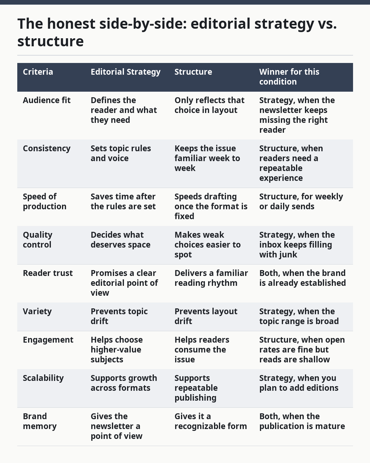
The truth is, most newsletters fail at both levels. They have no editorial rulebook, and they have no readable shape. Fixing one without the other only solves half the problem.
When should you change the structure?
You should change the structure when the format no longer matches the reader’s behavior or the newsletter’s purpose. That usually shows up in reply quality, click patterns, and the amount of editing needed to make each issue work.
Picture this: the newsletter used to be a short weekly brief, but the audience now wants deeper explanation. Or the publication used to be a long essay, but readers now skim on mobile and drop off early. The old structure can become a drag.
Good reasons to change structure include:
- the issue feels too long for the main use case
- the lead item is always getting buried
- readers keep skipping the same section
- the newsletter has shifted from news to analysis, or the other way around
- the team can no longer produce the current format reliably
Bad reasons to change structure include boredom, trend chasing, and copying another publication’s layout because it looks modern. A prettier frame does not fix a confused editorial plan.
When you do change structure, change one part at a time if possible. Move the lead. Tighten the opener. Rename the sections. Do not rebuild the whole issue unless the current format is clearly broken.
Structure should feel stable enough to trust, but not so rigid that it stops serving the reader.
What should you measure, and what should you ignore?
You should measure the signals that show the newsletter is being read and acted on, not just opened. Opens can help, but they do not tell the full story.
Picture this: a newsletter gets decent open rates but weak replies and low clicks. That may mean the subject line works, but the content does not earn the open. Or the audience likes the topic but not the format. Numbers without context can mislead fast.
Useful signals include:
- reply quality
- click-through on the main CTA
- scroll depth or completion, if available
- saves or forwards
- unsubscribes after specific issue types
- direct feedback from readers
A newsletter strategy gets stronger when those signals shape future issues. If readers always ignore the second block, cut it or make it shorter. If replies come in after opinionated leads, that tells you the audience wants judgment, not just summaries.
Ignore vanity signals that do not help the publication improve. A huge list with poor engagement can still be a weak newsletter. A smaller list with strong replies can be much healthier.
One caution: do not turn the newsletter into a lab report. Readers are not there to help you hit dashboards. They are there to get something useful. Measure the issue, yes — but write for the human first.
What newsletter structure mistakes hurt the most?
The biggest mistakes are burying the lead, repeating the same point in multiple blocks, and trying to make every issue serve every reader. Those choices make the newsletter hard to scan and hard to remember.
Picture this: a reader opens your issue and sees a long intro, five short items, and a vague close. Nothing feels prioritized. Nothing feels chosen. That is not a newsletter. It is an inbox habit.
The most common failures are:
- No clear lead — the issue never says what matters most
- Too many equal items — everything looks the same, so nothing stands out
- Weak editorial filter — the publication accepts too much
- Voice drift — the tone changes from issue to issue
- No stable CTA — the reader is never told what to do next
- Overdesigned layout — the frame gets more attention than the writing
The fix is usually not more content. It is less, arranged better. A newsletter with one strong point and a clean path to it will usually outperform a busier issue with no center.
Here’s the catch: good structure is invisible when it works. Readers do not praise the architecture. They just keep opening.
What is the best editorial strategy for a newsletter that needs to grow?
The best growth strategy is to become more specific before you become broader. Growth usually comes from sharper value, not a wider topic list.
Picture this: your newsletter has a modest but loyal audience. The temptation is to add more topics, more sections, and more content types. That often weakens the thing people already trust.
A better growth strategy is:
- tighten the audience definition
- make the core promise easier to repeat
- improve the lead item
- keep the structure stable
- add only one new section at a time
The fastest-growing newsletters often have a clear point of view and a dependable format. Readers know what they will get, and they know why it matters to them.
That does not mean the newsletter should be rigid. It means the core should stay recognizable while the examples, references, and applications evolve. Growth comes from clarity, not clutter.
The best part? A clear structure makes delegation easier. If another writer can step into the format and still preserve the voice, the editorial strategy is doing its job.
FAQ
How long should a newsletter be?
A newsletter should be as long as it needs to be to deliver the promised value, and no longer. For many weekly issues, that means a short lead plus a few tight supporting blocks, not a giant essay. If readers are consistently dropping off before the end, the issue is probably too long or too repetitive.
How many sections should a newsletter have?
A newsletter usually works best with 4 to 6 sections that each do a different job. That gives you enough room to create rhythm without making the issue feel crowded. If every section feels essential, the editorial filter is too loose.
Should every newsletter have the same structure?
Yes, a recurring structure helps readers know where to look and helps the writer produce the issue faster. The structure can evolve over time, but the basic order should stay familiar. If the format changes every week, the newsletter starts to feel unstable.
What is the difference between editorial strategy and content planning?
Editorial strategy sets the rules for what the newsletter is and what it will cover. Content planning turns those rules into specific issue ideas. Strategy is the map; planning is the route for the next issue.
How do I know if my newsletter is working?
A newsletter is working when the right readers keep opening, reading, replying, and taking action. Opens alone are not enough. Strong replies, useful clicks, and low confusion around the issue’s purpose are better signs that the structure and strategy are doing their jobs.
Drafted with AI; not yet reviewed by a person.