Last updated: November 19, 2026
Quick Answer: a mobile AI tools newsletter is easiest to scan when it uses one column, short blocks, and one clear action; this guide shows how to do that in 7 steps. A mobile newsletter layout for How to make an AI tools newsletter easier to scan on mobile works best when the subject line, preview text, first screen, and buttons all do one job: show the point fast. Use short paragraphs, wide tap targets, and a single-column responsive email design. The steps below show what to change, in what order, and what to leave alone.
Key Takeaways
- Fix the top of the message first; the first screen shapes whether the scan feels quick or tiring.
- Use one column, short paragraphs, and simple blocks so an AI tools newsletter stacks cleanly on mobile.
- Short text blocks help readers catch the point quickly instead of searching through long sentences.
- Make tap targets large enough for a thumb and spaced far enough apart to reduce mis-taps.
Start with the first screen on a phone
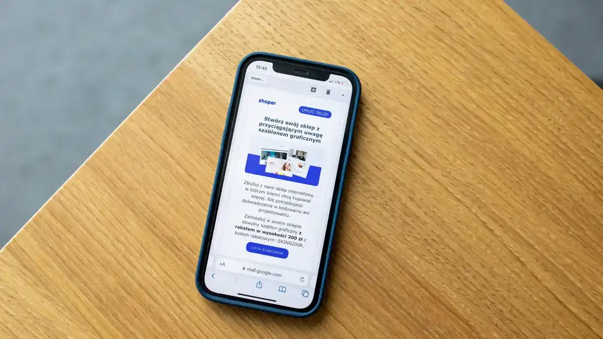
Picture this: you open your own email on a 6-inch screen and the useful part sits below the fold. Fix the top of the message first, because that first screen decides whether the scan feels quick or tiring.
A strong mobile newsletter layout puts the main promise, the lead item, and one action near the top. Keep the opening block to 2 or 3 short lines, then place the first link or button before the inbox preview runs out. A long intro burns space that should be doing work.
Use this order:
- Put the newsletter name and topic in the first line or two.
- Lead with the most useful AI tool or tip, not the backstory.
- Keep the first paragraph under 40 words if you can.
- Add one clear button or text link before the second screenful.
- Leave room for the preview text to do part of the job.
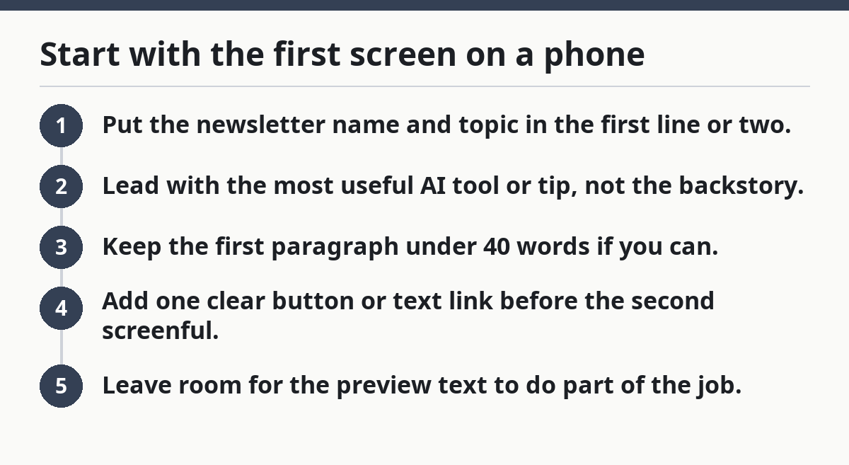
That structure helps in a mobile inbox, where the subject line and preview text may be the only things a busy person sees before opening. On Apple Mail, Gmail, and Outlook, the first screen can vary by device, but the rule stays the same: the top needs a clean read in under a glance.
Here’s the catch: a strong top block can still fail if the preview text is weak. The inbox shows those words before the message is opened, so if they repeat the subject line or start with “View in browser,” you waste the one line that matters most.
A useful mobile open often includes:
- one clear subject line
- one short preview text line
- one headline
- one action
Not five.
How do I format an AI tools newsletter for a small screen?
You format an AI tools newsletter for a small screen by using one column, short paragraphs, and simple blocks that stack cleanly in any email client. That is the core move. Responsive email design is doing most of the work for you, but only if the content stays light enough to stack without clutter.
Picture this: you are scrolling with one thumb and every item starts to blur together. The layout should break that chain. Use 1-column structure, generous spacing, and plain headings so each tool or tip looks like a separate stop, not a wall of text.
A good setup usually includes:
- one main headline
- one intro paragraph
- 3 to 5 short item blocks
- one button per block or one button at the end
- a simple footer
Avoid multi-column grids unless you know your email builder and client support them well. Many email clients will collapse them in awkward ways, especially on older Android devices or in Outlook desktop. A two-column card layout that looks neat on desktop can turn into a cramped stack on mobile.
The truth is, mobile-friendly formatting is mostly subtraction. Cut sidebars. Cut nested boxes. Cut tiny captions that compete with the main text. A clean single column gives the eye one path down the page, which is exactly what scan behavior needs.
Authoritative guidance from the Email Markup Consortium and Litmus both points in the same direction: design for predictable rendering across clients, not for a perfect mockup in one tool. The Email Markup Consortium recommends testing across clients, and Litmus documents how rendering changes between inboxes and devices.
Which text changes make scan speed better?
Short text blocks make scan speed better because the eye can catch the point in one look instead of hunting across long sentences. That matters most in an AI tools newsletter, where the message often includes names, use cases, and links that already ask for attention.
Picture this: you are listing five tools, each with a name, a use case, and a quick note. If each block runs to 5 or 6 sentences, the page turns into a wall. If each block stays to 2 short paragraphs, the message becomes easy to pick apart.
A practical rule set:
- Keep most paragraphs to 1 to 3 sentences.
- Put the tool name or use case in the first line.
- Break up long explanations with bullets.
- Keep bullets to one idea each.
- Use plain words for the action: “try,” “compare,” “save,” “watch.”
Don’t bury the point under soft intros like “This week we’re excited to share…” The opening line should say what a person can do with the tool or why it matters. A scan-friendly block sounds direct because the inbox is not a place for warm-up laps.
Short text also helps on small screens where zooming is annoying. No one wants to pinch and drag through a 180-word block just to reach the link. If the newsletter has a lot to say, split it into separate items rather than one long feature.
Use this as a rough trim pass:
- First sentence: the claim or benefit
- Second sentence: the use case
- Third sentence: the link or next step
That pattern keeps the section useful without making it heavy.
What button size and spacing work on mobile?
Button size and spacing work on mobile when a tap target is big enough to hit with a thumb and far enough from other taps to avoid mistakes. Small links stacked too close together are a common email client problem, especially in dense templates.
Picture this: you are tapping a “Read more” link while walking to a meeting. If the button is tiny, or if the next link sits right under it, the wrong tap is easy. That creates friction the moment the newsletter should be easy.
Use these practical rules:
- Make buttons at least 44 pixels tall when your builder allows it.
- Keep 16 pixels or more of space around buttons and clickable links.
- Use one main button color so the action stands out.
- Keep the button label short: “Read tool,” “Open guide,” “See example.”
Don’t stack three calls to action inside one tight block. That looks busy on desktop and worse on mobile. The eye needs one obvious path, not a choice puzzle. If you need two actions, separate them with white space or place one below the fold.
Button labels matter too. “Click here” gives no clue. “See AI writing tool” tells the person what waits on the other end. That saves taps because the action is obvious before the thumb moves.
Common button mistakes that hurt mobile scans
- Tiny tap zones cost clicks. Fix: widen the button, not just the text.
- Crowded links cause mis-taps. Fix: add vertical space between actions.
- Low-contrast buttons disappear on bright screens. Fix: raise contrast between text and background.
- Too many CTAs split attention. Fix: choose one main action per section.
A newsletter that respects thumb space feels calmer right away. That calm is part of scanability.
How should preview text and subject line work together?
Subject line and preview text should work as a pair, with the subject naming the topic and the preview text adding the reason to open. That pair is part of the mobile inbox, and it matters before the body has a chance to help.
Picture this: your subject line says “New AI tools this week,” and your preview text repeats the same words. You wasted a precious line. The preview text should answer the next question instead: what changed, what’s useful, or why this issue is worth a look.
A stronger pairing looks like this:
- Subject: “3 AI tools for faster meeting notes”
- Preview text: “One saves clips, one drafts summaries, one helps you sort action items.”
That gives the inbox something concrete without overselling. It also sets up the scan inside the email, because the open promise matches the structure below.
Keep these rules in mind:
- Keep subject lines short enough to survive mobile truncation.
- Write preview text as a real sentence, not filler.
- Avoid repeated words between the two lines.
- Put the most specific detail in the preview text if the subject is broad.
This is also where emojis and symbols need restraint. They can help or hurt depending on the tone and the inbox, but they should never replace clarity. A plain line that says what’s inside beats a clever line that hides the point.
If the issue has several AI tools, the preview text can name the first item or the theme for the day. That sets the pace before the message opens.
What should the body look like inside an email client?
The body should look like a short stack of clean blocks that an email client can render without drama. That means simple HTML, no fragile design tricks, and enough space between sections to keep the eye moving.
Picture this: you open the message in Gmail on Android, then again in Outlook, and the layout shifts each time. That is normal. The safest path is a single-column responsive email with headings, plain text, and images that do not carry the whole message.
A good body structure looks like this:
- one intro block
- one tool or idea per section
- one image only if it adds meaning
- one button or link per section
- a short closing line
Use headings that tell the truth fast. “New AI note tool” scans better than “Editor’s choice.” Save decorative language for the top line if you want it at all.
If you use images, keep them narrow enough to scale cleanly and give them useful alt text. Many email clients block images at first or load them late. A text-first message survives that delay. A message that depends on a screenshot does not.
Be careful with long headers, sidebars, and nested cards. They may look polished in a desktop preview and then stack in a way that hides the point on mobile. That trade-off is why many experienced email builders stick to narrow content blocks and avoid ornate frames.
For this topic, plain beats fancy.
What mistakes make a mobile newsletter hard to scan?
The biggest mistakes are dense text, tiny links, and layouts that fight the screen instead of fitting it. Those errors raise the effort needed to find the useful part, and effort is what mobile readers punish first.
Picture this: you are halfway through the inbox and your thumb has already done too much work. If the newsletter uses long paragraphs, tight spacing, and two or three calls to action in one block, the scan slows down fast.
Watch for these common failures:
- Long opening blocks hide the main point. Cost: the top of the email feels heavy. Fix: move the point into the first 2 lines.
- Tiny tap targets create mis-clicks. Cost: frustration and accidental exits. Fix: enlarge buttons and separate links.
- Multi-column layouts collapse badly in some email clients. Cost: broken reading order. Fix: use one column.
- Preview text filler wastes inbox space. Cost: fewer opens from the right people. Fix: write real preview copy.
- Image-only sections vanish when images are blocked. Cost: the message loses meaning. Fix: keep the key message in text.
On the flip side, a mobile-friendly issue does not need to be minimal in spirit. It just needs a clear path. You can still cover several AI tools, compare use cases, and point to one strong action per item. The difference is that the page makes each piece easy to spot.
If you want a benchmark, open the draft in at least two email clients before sending: one on iPhone Mail and one on Gmail mobile. Those two usually show enough variation to expose spacing problems, text overflow, or broken stacking.
For broader newsletter craft, the hub guide to Free AI tools newsletter — The Complete Guide fits as the next stop after layout.
Which quick edits help most before you send?
The fastest edits are the ones that change what the thumb sees first: trim the top, space the links, and strip the extra words that crowd the screen. That gets you most of the way there in one pass.
Picture this: the newsletter is written, but it still feels busy on a phone. You do not need a full rewrite. A 10-minute cleanup can change the scan speed more than a brand-new template.
Use this checklist before sending:
- Open the draft on a phone, not just desktop.
- Check the first screen for one clear point.
- Shorten any paragraph that runs long on mobile.
- Make sure the main button is easy to tap.
- Remove one extra CTA if the page feels crowded.
- Confirm the preview text does real work.
- Scan for any place where a heading and paragraph blur together.
That final scan is where bad spacing usually shows up. If the text looks like a single gray block, cut it again. If the button sits too close to another link, widen the gap. If the image carries the meaning, add the same meaning in text.
The goal is not to make the newsletter plain. The goal is to make the useful parts easy to reach in a mobile inbox, no matter which email client opens it.
What makes a newsletter mobile-friendly?
A newsletter is mobile-friendly when it stacks cleanly, reads in short blocks, and gives the main action enough space to tap. It should work in a mobile inbox without zooming or side scrolling. A single-column responsive email design is the safest starting point, and clear preview text helps before the open.
Why does mobile formatting matter?
Mobile formatting matters because many people first see email on a phone, not a desktop. If the layout is cramped or hard to tap, the message takes longer to read and feels like work. Good formatting keeps the scan quick, which makes the content more likely to get attention.
Drafted with AI; not yet reviewed by a person.