Last updated: November 19, 2026
A free AI tools newsletter needs a layout that people can scan in 10 seconds and still know what to click. This article answers how to format a free AI tools newsletter for fast scanning with a layout built for quick reads, not long browsing. The best newsletter layout usually uses short section labels, consistent tool cards, and one clear CTA per item. This guide shows the section order and readability choices that make that happen.
The fastest-scanning layout for an AI tools newsletter
Quick answer: a fast-scanning free AI tools newsletter works best when it keeps the first screen to a title, three item blocks, and one clear next step. Picture this: you open an email on your phone, and the first screen shows a title, three item blocks, and one clear next step. That is the format to aim for, because email layout usually beats clever copy when the reader is rushing.
A fast-scan newsletter has a simple pattern: headline, short intro, grouped tools, and a single closing CTA. Keep the top of the email clean, with one line of context and no long preface. The reader should know where to start before they scroll.
Use this order:
- Subject line: one plain promise, like “3 AI tools for faster meeting notes”
- Preheader: a 6- to 10-word support line
- Intro: 1 short paragraph, not a mini essay
- Tool cards: one card per tool, in the same order each issue
- Wrap-up: one sentence and one CTA
The truth is, most readers do not read every line. They skim for the one tool that fits their task. If the layout changes every week, they have to re-learn the page. That costs attention.
A stable structure helps in two ways:
- It trains the eye to jump to the same places.
- It makes your issue look shorter than it is.
That second point matters. A newsletter with four tight blocks feels easier than one long, mixed page, even if the word count is the same.
What should the top of the newsletter do?
The top of the newsletter should tell readers what kind of AI tools are inside and why this issue is worth a look. The top is not the place for backstory, sponsor chatter, or a 4-paragraph welcome note.
Because of that first-screen job, the top has to sort readers fast. Picture this: you have one thumb on the screen and 5 seconds before you decide to save the email or archive it. The top of the page has to do the sorting for you, fast.
A good top section does three jobs:
- Names the issue theme in plain words
- Sets a 1-line promise
- Gives a reason to keep scrolling
A strong intro might mention a use case, a category, or a narrow theme like writing, research, design, or meeting notes. That gives the rest of the email a frame. Without it, the tools feel random.
The bad version is a warm-up paragraph that says nothing specific. It burns the first screen and pushes the first useful item down. That is a common mistake. The cost is simple: fewer opens turn into fewer clicks.
Use a top section like this:
- Title: short and direct
- Intro line: what this issue covers
- Optional note: one sentence about how the tools were chosen
Keep it under 60 words if you can. Shorter is usually better here.
How do you format tool cards so readers can scan them?
Tool cards should all look alike, with the same fields in the same order, so the reader can compare them without effort. A card is the unit that makes an AI tools newsletter easy to scan.
Since readers compare by category, the card has to stay compact. Picture this: you scroll past three tools in a row. One has a long paragraph, another has a list, and the third hides the link in a sentence. That layout forces the reader to decode each block from scratch.
The fix is a repeatable card structure. Use a 3- to 5-field format and keep each field short:
- Tool name
- What it does
- Best for
- One standout detail
- CTA
If you want a cleaner read, make the name bold and keep the rest in plain text. Use line breaks, not dense paragraphs. On mobile, a block with 4 short lines is much easier to scan than a wall of text.
Here’s a simple pattern:
- Tool name
- One-sentence summary
- Best-for line
- Link or button text
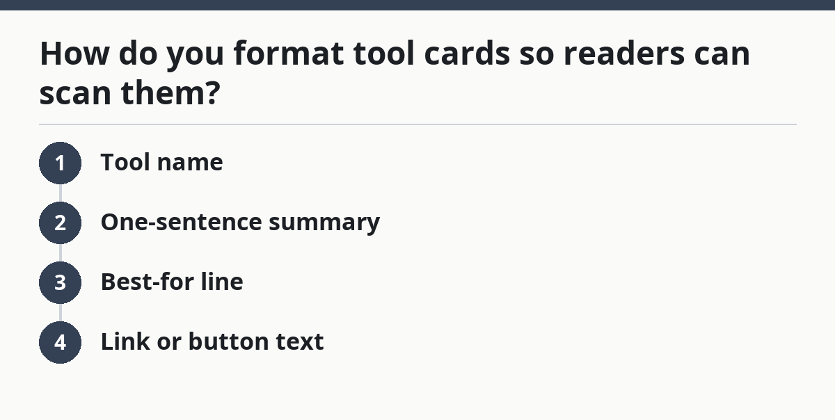
That pattern works because the eye learns it once and repeats it. The reader can stop at the line they need.
Avoid these mistakes:
- Long feature lists that bury the point
- Mixed card lengths that make comparison hard
- Hidden links that make the CTA easy to miss
- Multiple CTAs in one card, which split attention
A card should answer one question fast: “Is this for me?” If it does that, the click path gets easier.
Which visual hierarchy makes an email easy to skim?
Visual hierarchy makes the newsletter readable by showing the eye what to hit first, second, and third. Without it, every block looks equal, and equal blocks are hard to skim.
When a category section appears, the same rule still applies. Picture this: your reader lands on a phone screen with tiny type, a few logos, and dense copy. If everything has the same weight, nothing stands out. That’s not a style problem. It’s a navigation problem.
Use hierarchy with simple cues:
- Bigger text for the issue title
- Bold text for tool names
- Short subheads for categories
- White space between cards
- One accent color for links or buttons
That is enough. You do not need a heavy graphic system. In a newsletter, too many colors and boxes slow the reader down.
Keep paragraph length tight. In most sections, use 1 to 3 sentences per block. A single long paragraph is easy to ignore. Two short ones with a blank line between them feel lighter and more usable.
Instead of writing a long note, break it into short steps. The skimmers jump to the bold parts. The slower readers still get a clear path through the email.
One more rule: do not make every line bold. If everything is highlighted, nothing is highlighted. Reserve bold for the name, the key benefit, and the CTA. That gives the page a rhythm.
What bullet formatting works best in a free AI tools newsletter?
Bullet formatting works best when each bullet carries one idea and one action, not a dump of features. Bullet lists are for speed, so they should read like notes, not a brochure.
Because the list may sit under a category or a tool card, keep the sequence tight. Picture this: you want to compare a writing tool, a summary tool, and a design tool in under a minute. Bullets help only if they stay short and parallel. If one bullet is a full paragraph, the scan breaks.
Use bullets for:
- Key features
- Use cases
- Quick caveats
- CTA options
Keep each bullet to 8 to 14 words when possible. That range is short enough to scan and long enough to carry meaning. Start each list with the same kind of word or phrase, so the list feels smooth.
For example:
- Fast for meeting notes
- Better for team drafts
- Weak on image exports
That style gives the reader a clean compare-and-move-on path. It also makes the newsletter feel less crowded than a block of prose.
Do not turn bullets into a second article. If you need 6 or 7 bullets to explain one tool, the card is too heavy. Split it or cut it.
Use bullets for summary, not for drama. The point is to help the eye, not to impress it.
What order should the sections appear in?
The best section order is the one that gets readers to value fastest: intro first, strongest tools next, extra notes last. A newsletter that hides the good stuff too deep loses scans.
Since the reader is looking for quick value, the order should match that goal. Picture this: you have three strong tools and one decent one. If the weakest item opens the issue, the reader may never reach the better picks. Put the strongest value near the top, not after a long setup.
A practical order is:
- Header and intro
- Top tool or top theme
- Second and third tool cards
- Short note or tip
- Final CTA
If your issue has categories, keep them in a fixed order every time. For example, you might move from writing to research to ops. That makes the structure predictable, which helps fast scanning.
The catch is that section order should match reader intent, not your internal process. If your audience cares most about content creation, do not bury that behind admin tools. Lead with the thing they came for.
A simple rule helps here: the more likely a section is to drive a click, the earlier it should appear. That does not mean every issue needs the same first tool forever. It means the first visible items should earn their place.
What should the CTA look like in a newsletter people skim?
The CTA should be short, visible, and tied to one action, because a skim reader will not hunt for a clever phrase. A clear CTA closes the loop without making the reader work.
After the tool card, the next step should be obvious. Picture this: the reader has found one tool they like. They need to know whether to visit the site, save the link, or try the demo. If the CTA is vague, the moment passes.
Use one CTA style per issue:
- Button text: “Try the tool”
- Text link: “See the demo”
- Footer link: “Read more”
Keep the CTA near the end of the card or the issue, not buried in the middle. If you use buttons, keep the label plain. “Learn more” is fine. “Transform your workflow” is not.
A CTA also benefits from spacing. Give it room above and below so it doesn’t blend into the surrounding text. On mobile, that gap does real work.
Don’t stack three action links under one tool. That turns a quick decision into a small maze. One tool, one next step.
The most effective CTA is the one that matches the reader’s intent without demanding a speech. Clean, plain, and hard to miss.
Common formatting mistakes that slow readers down
The most common mistake is trying to make the newsletter look rich instead of easy. Pretty layouts can still fail if the reader has to hunt for the point.
After the CTA, the layout should still stay simple. Picture this: you open a newsletter and see long intros, uneven cards, and three different link styles. It feels busy, but not useful. That kind of page asks for more attention than most readers want to give.
Watch for these problems:
- Too much intro copy: costs the first screen
- Uneven card lengths: makes comparison harder
- Too many fonts or colors: weakens hierarchy
- Tiny link text: hides the action
- No repeated structure: forces re-reading
The fix is not more design. It is stricter structure. Keep the same card shape, the same order, and the same CTA position across issues. Readers learn patterns faster than they read prose.
One honest limitation: a highly visual magazine style is a bad fit if your main goal is scan speed. That format can work for a brand story, but it slows down a tools digest. If speed is the goal, spare layout wins.
A newsletter meant for quick scanning should feel almost plain. That is not a flaw. It is the point.
How to format a free AI tools newsletter for fast scanning
A fast-scanning free AI tools newsletter uses a stable newsletter layout, short tool cards, and one clear CTA so readers can find value without slowing down. That is the format to copy.
For this topic, the numbers stay simple: keep the top to 60 words if you can, aim for 1 to 3 sentences per block, and use 4 short lines in a card when mobile reading matters most. The cleanest structure is simple: tell the reader what this issue covers, group tools in the same order each time, and keep every block short enough to read on a phone.
If a section does not help the eye move faster, cut it. For a page that supports the larger guide, this one job matters most: make the email easy to scan before it tries to persuade anyone. That is the format readers keep open.
Key Takeaways
- Put the promise at the top, then move straight into tools.
- Make each tool block look the same so the eye can compare fast.
- Use bold text, white space, and short bullets to guide scanning.
- Keep one action per card so the reader does not stall.
- If the layout feels busy, it is probably too hard to scan.
What sections should come first in a newsletter?
The first sections should be the title, a short intro, and the first tool card. That order gives the reader the promise, the frame, and the payoff in one screen. If a newsletter starts with a long welcome or a sponsor block, the scan slows down before it begins. For a quick-reading format, the first screen should do the most work.
How do you make a newsletter easy to skim?
A newsletter is easy to skim when each block looks the same and each block has one job. Use short paragraphs, bold tool names, enough white space, and one CTA per item. On mobile, that structure matters even more because the reader is moving through a narrow screen.
Drafted with AI; not yet reviewed by a person.