Last updated: November 19, 2026
Key Takeaways
- Answer the reader’s question quickly, or they keep scrolling.
- Lead with the use case so readers know why the tool exists.
- A setup note should flag requirements up front to save time.
A weak tool description makes people stop, scan, and leave. A strong one tells them what the tool does, who it helps, and what to do next in one quick read. Write for the next click, not for the archive. The steps below show how to shape tool descriptions that help readers act fast so readers can decide fast.
What a fast tool description must do
Quick answer: a fast tool description usually does three things in one short read. Picture this: you’re scanning a tool card in a newsletter, and you need to know in 10 seconds if it fits your use case. The description has to answer that question fast, or the reader drifts on.
A good tool description does three jobs at once: it names the use case, gives one clear benefit statement, and points to the next reader action. In AI tools newsletters, that usually means a short line, a setup note, and a best-for note. Three jobs. One card.
If the description needs a paragraph to explain itself, it’s already too slow. A reader should not have to decode marketing language, guess the audience, or hunt for the payoff. The goal is not to sound clever. The goal is to help a person decide in a few seconds whether to open, save, or skip.
Use this rule of thumb: if the reader can’t say “This is for me” after one pass, the description is failing. The next sections show how to fix that without bloating the card.
- Name the tool’s use case first.
- State the benefit in plain words.
- Add one detail that reduces doubt.
- End with a clear reader action.
What information should come first in tool descriptions?
Picture this: you’re writing a tool card for an AI tools newsletter, and the first line has to earn attention before the scroll moves. The first thing should be the use case, because that tells the reader why the tool exists.
Lead with the task, not the brand. “Draft subject ideas for product launches” tells a reader more than “AI writing assistant.” That difference matters on a phone screen, where every extra word slows the decision.
The best opening line usually uses one concrete noun and one active verb. It should sound like something a person would say out loud. “Turns meeting notes into a one-page recap” works better than “Streamlines workplace productivity.”
A useful opening line often includes a signal such as “for teams,” “for solo creators,” or “for quick drafts.” Those phrases act like filters. They tell the wrong person to keep moving and the right person to stop.
If a first line tries to do everything, it usually does nothing well. When it names the use case, audience, and outcome all at once, it turns into a knot. Keep the first line tight, then let the next line handle the payoff.
- Start with the task.
- Use audience tags only when they help sorting.
- Keep the line short enough to scan in one breath.
- Avoid vague verbs like improve, boost, or help.
How do I write a benefit statement that feels real?
Picture this: you’re looking at a tool card that sounds useful but never says what changes for the reader. The benefit statement should answer that gap in 8 to 14 words, or close to it, without sounding like ad copy.
The strongest benefit statement names the result, not the feature. “Cuts first-draft time” is sharper than “powered by advanced AI.” A reader cares about the output they get, not the engine under the hood.
A useful benefit statement often pairs the result with a constraint. “Builds a weekly roundup from saved links” is clearer than “creates summaries.” The constraint tells the reader what kind of input the tool needs and what shape the output takes.
This is where many descriptions go vague. They say the tool is “simple,” “smart,” or “efficient,” but those words tell the reader almost nothing. If the benefit can’t be seen, touched, or checked in a workflow, it won’t move action.
Use plain verbs: writes, sorts, summarizes, tags, drafts, checks, compares, extracts. Those verbs map to real work. They also make the tool easier to place inside a newsletter without a long explanation.
- Name the output.
- Show the task it shortens.
- Avoid abstract praise.
- Keep one benefit per line.
How to add a setup note without slowing the card
Picture this: you’re deciding whether a tool is worth a click, and the missing setup detail is what stops you. A setup note tells the reader what’s required before the tool works, and that saves time.
This note should be short and specific. Mention one of these if it matters: browser access, login, file upload, template use, or an email address. If the tool needs a long setup, say so plainly. If it works in one step, say that too.
A setup note is not a tutorial. It does not need every button or menu. It only needs to remove the first point of friction so the reader can judge effort. “Requires a Google account” is enough when that’s the main gate. “Works from pasted text” is enough when the tool is light to use.
The truth is, setup notes are where trust starts. If a tool says “instant” but hides a sign-in wall, readers learn not to trust the card. If a tool needs a CSV upload or a template, say it up front and spare them the surprise.
Keep this line factual, not promotional. A setup note earns its place when it answers the question “What do I need before this works?”
- Mention the first gate.
- Name the input type if relevant.
- Say if login is required.
- Keep claims modest and exact.
How to write a best-for note readers trust
Picture this: you’re comparing three tools that all claim to save time, and the one with the clearest best-for note wins the click. A best-for note helps a reader match the tool to a role, workflow, or output size.
Use the phrase to narrow the fit, not to flatter the product. “Best for solo writers who need fast outlines” is useful. “Best for anyone who wants better content” is not. The second version is too broad to guide a decision.
A best-for note works best when it names one job, one user type, or one context. You do not need all three. Too many labels make the card feel padded, and padded cards get ignored.
This note is also where you can separate similar tools. One might be best for quick summaries, while another is better for team review or deeper editing. That difference helps readers pick faster and avoids a samey list of descriptions.
When the fit is too narrow, the note stops helping. If it fits everyone, it is useless. Aim for a clear lane, not a highway.
- Name one user type.
- Name one job.
- Use one setting if it matters.
- Avoid broad praise with no filter.
What limitations should a good description admit?
Picture this: you’re almost ready to use a tool, but the description makes it sound perfect, which makes you suspicious. A good description admits one or two limits so the reader can judge fit honestly.
Limitations are not a weakness when they save time. If a tool is weak on long-form editing, needs clean input, or works best only with English text, the card should say so. Hiding that detail wastes the reader’s time later.
This section is where generic articles usually fail. They tell you to be concise but never say what honesty looks like. Honest descriptions make trade-offs visible: speed over depth, ease over control, or automation over flexibility.
If the tool is a poor fit for a certain person, say it. That keeps the card from sounding like every other tool card on the page. It also protects the rest of the newsletter from clutter.
A limitation line should be blunt and useful. “Not ideal for long reports” is clearer than “may not suit all needs.” One line like that can save a reader from a bad click.
- Name the main trade-off.
- Say what the tool does not handle well.
- Keep the limit tied to real use.
- Avoid soft language that hides friction.
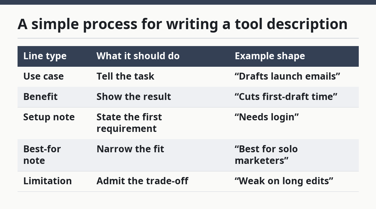
A simple process for writing a tool description
Picture this: you’re starting from a blank card and need a description that works in under a minute. The fastest practical path is to write the use case, the benefit, the setup note, the best-for note, and the limitation in that order.
That order keeps the description moving from “what it is” to “what I get” to “what it costs me in time.” It also mirrors how many readers scan. They want the job, then the payoff, then the catch.
Use this process every time:
- Write a 6 to 10 word use case line.
- Add a benefit statement with one concrete result.
- Add a setup note with the first required step or access point.
- Add a best-for note that names one user or context.
- Add one limitation that blocks the wrong reader.
That gives you a description with shape. It does not ramble, and it does not pretend the tool is for everyone. The card becomes easier to scan because each line has a job.
If you want a quick test, cover the tool name and read the rest. If the description still tells a clear story in one breath, it’s doing its job. If not, cut the weakest line and rewrite it with a sharper verb.
| Line type | What it should do | Example shape |
|---|---|---|
| Use case | Tell the task | “Drafts launch emails” |
| Benefit | Show the result | “Cuts first-draft time” |
| Setup note | State the first requirement | “Needs login” |
| Best-for note | Narrow the fit | “Best for solo marketers” |
| Limitation | Admit the trade-off | “Weak on long edits” |
What a strong tool card looks like on the page
Picture this: you’re reading a newsletter and the tool card sits between a short intro and a link. The card has to do its job without a long setup paragraph before it.
A clean tool card usually has one short headline line, one benefit line, one setup note, and one line for fit or limit. That structure lets a reader decide fast without rereading the whole block.
Keep the language concrete. “For turning article notes into social posts” is cleaner than “for helping teams repurpose content more effectively.” The first line gives a job. The second sounds like a deck slide.
A page that supports an AI tools newsletter should also keep the card readable on mobile. That means short lines, hard breaks, and no wall of text. Long paragraphs bury the action and make the page feel heavier than it is.
The best part is that a tight card also helps the editor. It makes it easier to place the tool in a list, compare it with other tools, and keep the reader moving.
- Short headline line.
- One benefit line.
- One setup note.
- One fit or limit line.
How do I know the description is good enough?
Picture this: you’re reviewing the card before publishing, and you need a fast way to check if it will help readers act. A good tool description lets the right reader decide in one pass and lets the wrong reader move on without confusion.
Use a 15-second check. Read the card once and ask: What does it do? Who is it for? What does it need? What’s the catch? If any answer is fuzzy, the description is not ready.
Strong descriptions are plain, not polished to death. They sound like a helpful note from someone who knows the tool, not like a slogan. If a phrase could fit ten different tools, it belongs nowhere on the card.
A final pass should cut adjectives that do no work. “Smart,” “easy,” and “powerful” rarely help unless the line also says what changes for the reader. Keep the nouns and verbs; trim the fog.
That approach is what helps readers act fast. It gives them enough detail to choose without making them work for it. And it keeps the newsletter useful instead of decorative.
- Can a reader state the use case in one breath?
- Does the benefit point to a real output?
- Is the setup cost visible?
- Is the limit honest?
A quick model for an AI tools newsletter description
Picture this: you’re writing for a newsletter slot, and you need the description to pull its own weight in one small box. A practical model is: use case first, benefit second, setup third, fit fourth, limit last.
For example: “Turns rough notes into a publishable summary. Good for editors who need a fast first draft. Needs pasted text or a file upload. Not built for deep line editing.” That structure gives the reader a clean path from interest to action.
This is the kind of description that belongs in a tool card because it helps the reader decide fast without a sales pitch. It also gives the newsletter a steady voice across different tools, which makes comparison easier on the eye.
If the page links up to the broader guide, keep the internal note brief and useful: this article supports the larger free AI tools newsletter guide by showing how to write cards that speed up choice. The local job here is narrower. It is about description quality, not the whole newsletter system.
A good tool description does not try to sell everything. It gives the right reader a reason to move and the wrong reader a clean exit. That is what makes it worth a click.
- Keep one idea per line.
- Use concrete nouns.
- Tell the reader what happens next.
- Leave out the fluff.
How long should a tool description be?
A tool description should be short enough to scan quickly and long enough to answer the first decision questions. If it takes a full paragraph to explain one tool, the card is carrying too much. Aim for a few tight lines that cover use case, benefit, setup, fit, and limit.
What information should come first?
The use case should come first. Readers want to know what the tool does before they care about the brand, the feature list, or the styling. Start with the task in plain language, then add the result, the setup note, and the best-for note.
Drafted with AI; not yet reviewed by a person.