Last updated: November 20, 2026
Quick answer: use 1 promise, 1 signup form, and 1 sample issue. If you are writing How to Write a Landing Page for a Free AI Tools Newsletter, the page should tell visitors what they get, why it matters this week, and what happens after they enter an email. If the first screen cannot do that in about 10 seconds, the page is too vague.
Key takeaways
- Lead with the value of the newsletter, not the history of the project.
- Show one clear call to action above the fold and repeat it once lower on the page.
- Use sample issues, trust markers, and reader benefits to make the signup feel low risk.
- Keep the page short enough to scan on a phone, but specific enough to answer “what’s inside?”
- Skip clever copy that hides the offer; plain promise-based copy usually works better than foggy wording.
What should the page say first?
The page should say, in one sentence, what the free AI tools newsletter helps a reader do. Start with the newsletter landing page, the audience, and the payoff in plain words, such as finding useful AI tools faster, without forcing the reader to guess what the email contains.
That first line has one job: make the visitor stop and think, “This is for me.” A landing page for a free AI tools newsletter is not the place for a long origin story or a broad brand slogan. A reader wants to know the subject, the cadence, and the benefit in under 20 words if possible.
A simple structure works better than a clever one. State the topic, name the reader, and show the result. For example: “Get a weekly email with free AI tools, short notes on what they do, and quick picks worth trying.” That kind of sentence fits the page’s real job.
The opening also needs the subject to appear in a sentence a person would actually say. “Newsletter landing page” should appear naturally, along with “free AI tools newsletter,” because the reader is landing on a page, not reading a brand manifesto. That wording helps the page match the search query without stuffing the phrase into every line.
If the top of the page needs more than a headline, keep the supporting line to one tight sentence. A 2-line hero area usually gives enough room for the promise and the signup form without pushing the call to action below the fold on a phone.
How do I write the signup form?
The signup form should ask for only the email address unless there is a clear reason to ask for more. Every extra field raises the cost of saying yes, and on a simple newsletter page, that cost is usually not worth it.
The form label, button text, and privacy line do most of the work here. “Email address” is clear. “Get the newsletter” is weaker than “Subscribe free” or “Get free AI tools,” because the button should point straight at the benefit. A short note under the form can say that the email is for the newsletter only, if that is true and visible on the page.
How to write the landing page for a free AI tools newsletter
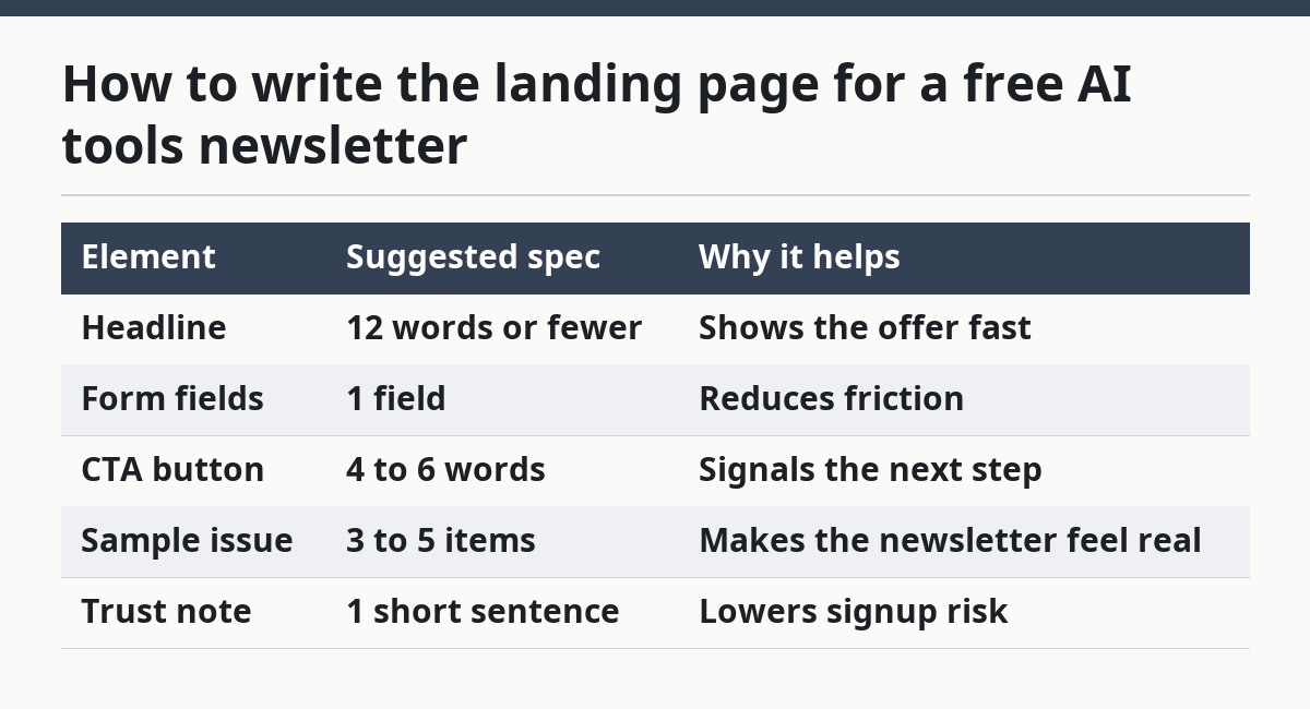
The best practical way to write the page is to build it in a fixed order, from promise to proof to action. Use the steps below, and keep each step to one job so the page does not sprawl.
| Element | Suggested spec | Why it helps |
|---|---|---|
| Headline | 12 words or fewer | Shows the offer fast |
| Form fields | 1 field | Reduces friction |
| CTA button | 4 to 6 words | Signals the next step |
| Sample issue | 3 to 5 items | Makes the newsletter feel real |
| Trust note | 1 short sentence | Lowers signup risk |
- Write the headline with the newsletter name and one benefit in 12 words or fewer, so the visitor understands the offer before scrolling.
- Add the signup form above the fold with one email field and one clear button, so the reader can act without hunting.
- Describe the value proposition in 2 short sentences, so the reader knows whether the newsletter saves time, shows new tools, or helps with a specific use case.
- Show 1 sample issue with a few real topic examples, so the reader can picture the email instead of imagining it.
- List 3 reader benefits in plain bullets, so the page explains what changes after the subscription.
- Add trust markers like a simple privacy note or a promise about email frequency, so the signup feels low risk.
- Repeat the call to action near the bottom of the page, so a reader who scrolls still has an obvious next step.
This order works because it answers the three questions most visitors ask in sequence: what is this, why should I care, and what happens if I sign up? A page that jumps straight into features without a promise loses the reader before the form appears.
The sample issue matters more than many generic guides admit. A newsletter about free AI tools can sound useful or vague, and the difference often shows up in one example. Mention the kind of items readers can expect, such as a short tool summary, a practical use case, or a quick note about what makes the tool worth a click.
Trust markers need to be specific, not decorative. A plain privacy line, a frequency note, or a short explanation of what readers will receive can help more than a row of badges. If the page says “1 email a week,” that is concrete. If it says “join a community,” that is softer and less useful unless the community itself is the main product.
One useful standard for this page is readability, not persuasion theater. The U.S. government’s plain-language guidance at plainlanguage.gov is a good reference for short sentences and direct wording, and Nielsen Norman Group has long discussed how users scan pages before reading them. Those ideas fit this page because a landing page has seconds, not minutes, to earn attention.
What belongs in the sample issue?
The sample issue should show 3 to 5 concrete items, not a vague summary of “great content.” A reader deciding whether to join a free AI tools newsletter wants to see the shape of the email before giving up an address.
A sample issue can include a tool name, a one-line description, and a plain use case. If the newsletter focuses on AI tools for writing, image work, search, or productivity, the sample issue should reflect that mix instead of listing random headlines. The goal is to make the newsletter feel real in under 30 seconds.
A good sample issue also lowers fear. Many visitors worry that a newsletter will be too long, too salesy, or too broad. Showing a short preview tells them what the email is like before they commit. If the preview is too polished and generic, though, it can backfire; readers may suspect the actual email will be fluffier than the sample.
Keep the sample issue short enough that it does not steal the whole page. One screenful on desktop, or about 6 to 8 lines of copy, is usually enough. The page should still leave room for the button and the reader benefits.
What makes the page worth trusting?
The page earns trust by saying exactly what happens after signup and by avoiding inflated claims. A free newsletter does not need a big promise; it needs a clear one.
Trust markers can include a no-spam note, a simple frequency line, and a clear statement about what the email covers. If the page says “free,” the page should also show how that free offer is delivered. If the newsletter sends a sample issue before the first full send, say so. If it does not, do not imply it.
The page should not try to sound like a software review site, a course sales page, or a hype page. That is a common mistake. When the copy promises too much, the signup form looks suspicious. When the copy is measured, the form feels easier to use.
A useful check is this: if a reader wanted to share the page with a friend in one sentence, what would that sentence be? If the answer is “It’s a free email with AI tools and short notes,” the page is close. If the answer takes 30 seconds and several clauses, the copy is still too fuzzy.
What should the call to action look like?
The call to action should tell the reader exactly what happens next in 4 to 6 words. A button that says “Subscribe free” or “Get the newsletter” is better than one that says “Submit,” because the reader should feel the result, not the form process.
The CTA works best when it is repeated twice: once near the top and once near the bottom. That is enough for a short landing page. More repeats can feel pushy, and fewer repeats force mobile visitors to scroll back up after they decide.
The button should sit beside the signup form, not float far away from it. A form with one field and one button is easier to scan than a longer form with side notes and multiple actions. If the page uses a supporting line under the button, keep it to one sentence. Long button copy makes the page feel crowded.
Think of the CTA as the final line of the pitch. The headline starts the case, the sample issue proves it, and the button ends the argument. If those three pieces disagree, the page feels off. If they match, the signup form feels like the natural next step.
What should I leave out?
Leave out anything that does not help a person decide in 1 scroll. A newsletter landing page is not the place for a full product roadmap, a long founder bio, or a list of unrelated topics.
The biggest mistake is writing for admiration instead of signup. Fancy language can make the page feel polished, but it often hides the offer. That costs trust and often costs clicks. Another mistake is making the page too broad: if the newsletter is about free AI tools, do not stretch it into every AI topic on earth. A vague promise attracts vague readers.
Do not bury the signup form under 3 long paragraphs. Do not make the reader hunt for the button on a phone. Do not ask for a name, company, phone number, or other fields unless there is a strong reason. Each extra request creates friction.
This page is not for readers who want deep education about AI itself. It is for readers who want a fast reason to join a curation newsletter. If the page tries to teach everything, it stops doing its real job.
What should a newsletter landing page say?
A newsletter landing page should say what the newsletter is, who it is for, and why the reader should care. It should also say what the reader gets after subscribing, in plain words and without a guessing game.
For a free AI tools newsletter, that usually means a short promise, a sample issue, and a clear signup form. The copy should feel specific enough that a person can picture the email, but short enough that the whole page still fits a phone screen. A good rule is one main promise, one proof point, and one action.
How long should a newsletter signup page be?
A newsletter signup page should be as long as needed to answer the main question and no longer. For a free AI tools newsletter, that often means a short page with one strong hero section, a sample issue, a few benefits, and a trust note.
Long pages can work if the offer needs explanation, but this kind of page usually does not. A visitor should be able to understand the offer in under a minute. If the page keeps going after the CTA, the extra copy should earn its place by removing doubt, not by repeating the same pitch in different words.
What makes someone subscribe to a niche newsletter?
A niche newsletter gets the signup when it feels useful, specific, and low risk. Readers subscribe when they think the emails will save time or help them find something they would not easily find alone.
For a free AI tools newsletter, specificity matters more than hype. A sample issue, a clear topic focus, and a simple privacy note can do more work than big promises. If the page shows exactly what lands in the inbox, the decision becomes much easier.
FAQ
How many words should the headline have?
A headline should stay at 12 words or fewer so the offer is visible fast.
How many form fields should a free newsletter page use?
It should use 1 field unless there is a clear reason to ask for more.
How many items should a sample issue show?
A sample issue should show 3 to 5 concrete items so readers can picture the email.
How often should the page repeat the CTA?
It should repeat the CTA 2 times: once near the top and once near the bottom.
Drafted with AI; not yet reviewed by a person.