Last updated: November 19, 2026
Quick Answer: In 24 hours, you can convert more newsletter readers into engaged subscribers by making the signup path obvious, keeping the form to 1 field when possible, and sending a welcome email fast.
This guide on how to convert newsletter readers into engaged subscribers settles where to place the signup form, what the call to action should say, and what to send after the click.
What changes a casual reader into a subscriber?
Picture this: you have someone reading your newsletter on a phone, skimming on a lunch break, and they like what they see. The job is to make the next step obvious, low-risk, and worth the email address. That means one visible CTA button, one short signup form, and one promise they can understand in 5 seconds.
The truth is, most readers do not need more convincing. They need less friction. If the signup form asks for 6 fields, if the call to action hides below the fold, or if the landing page sounds vague, interest leaks away.
Here is the catch: reader-to-subscriber conversion is not one trick. It is a chain.
- Reader sees a useful prompt.
- Reader understands what they get.
- Reader trusts the signup form.
- Reader gets a welcome email that confirms the choice.
A weak link breaks the chain. If the landing page is clear but the welcome email is silent, the subscriber goes cold. If the signup prompt is good but the form feels like work, the click dies there.
Build the signup path for how to convert newsletter readers into engaged subscribers
Picture this: you have a reader who is interested right now, but only for a few seconds. The signup path needs to work in that tiny window, and it should be obvious on desktop, mobile, and inside the newsletter itself. Short forms usually win because they ask for less and finish faster.
Start with the basics. Put the signup form where a reader already expects it: near the top of a landing page, inside a website footer, and at natural breaks in the newsletter. The footer matters because some readers scroll there on habit. The landing page matters because it gives one clean job to do.
Then trim the form. Ask only for what you truly need. If an email address is enough, stop there. Every extra field is a small tax on momentum, and the reader pays it with attention.
Use a CTA button that says exactly what happens next. “Subscribe” is fine. “Get the newsletter” is better if the benefit is obvious nearby. “Join for updates” is weaker because it sounds like work without a reward.
A practical setup looks like this:
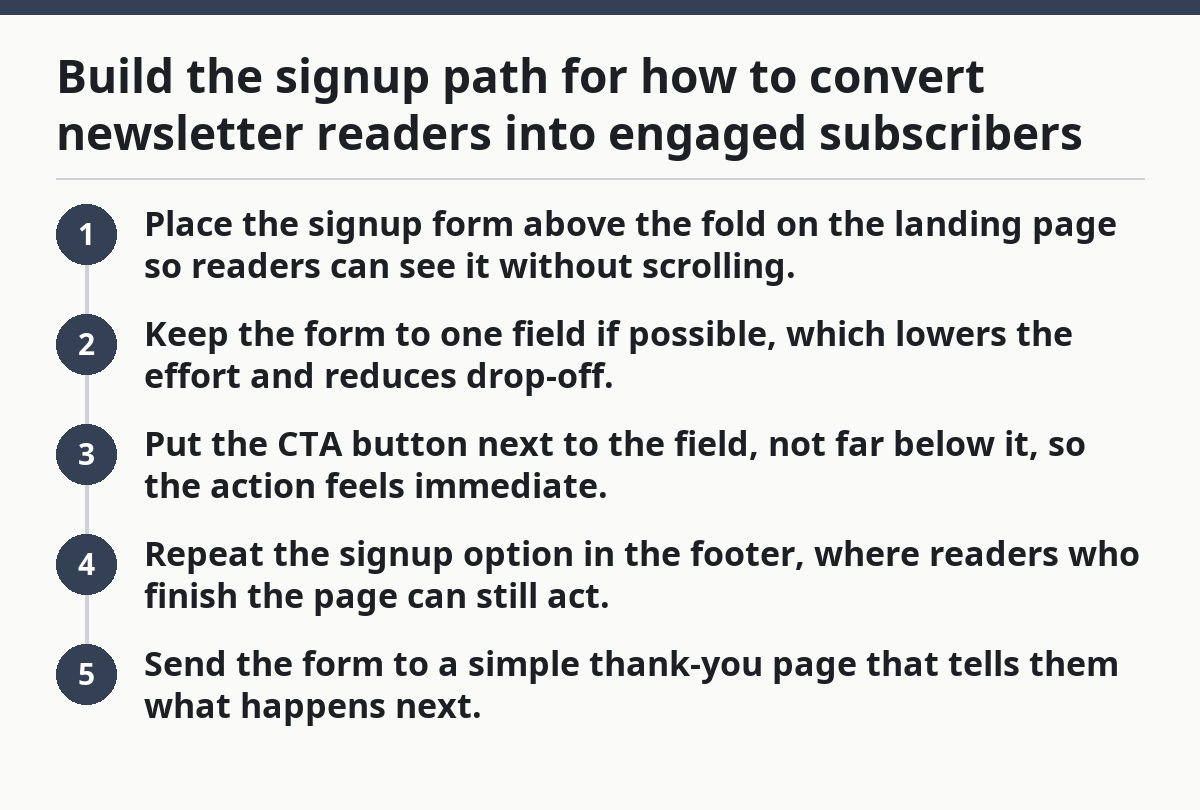
- Place the signup form above the fold on the landing page so readers can see it without scrolling.
- Keep the form to one field if possible, which lowers the effort and reduces drop-off.
- Put the CTA button next to the field, not far below it, so the action feels immediate.
- Repeat the signup option in the footer, where readers who finish the page can still act.
- Send the form to a simple thank-you page that tells them what happens next.
That last page is not decoration. It should confirm the signup, set the schedule, and tell the reader to check their inbox. A dead end wastes the click.
How do you write a CTA button that gets clicked?
A CTA button gets clicked when it sounds like a useful next step, not a marketing slogan. Button copy usually works best when it is short, plain, and tied to the benefit the reader already wants.
Picture this: you have a reader who has already read part of your newsletter and liked the tone. They are not looking for persuasion theater. They want a fast answer to a simple question: what happens if I tap this button? Clear usually beats clever.
The CTA button and the line beside it should work together.
- Button: “Subscribe”
- Support line: “Get the next issue in your inbox”
Or:
- Button: “Join the newsletter”
- Support line: “Short updates, no spam, easy unsubscribe”
That second line does important work. It can lower fear. Readers worry about inbox clutter, hidden frequency, and getting trapped. A short note on what they will receive can calm that fast.
The page itself should reinforce the button. If the button promises “weekly ideas,” the landing page should say weekly. If the button says “free newsletter,” the page should not suddenly sound like a lead-gen funnel.
One more thing: place the CTA where the eye naturally lands. On a landing page, that usually means near the top and again near the bottom. In a newsletter, it often means after a useful section, not before the reader has seen any value.
Use the same message in the signup prompt, the landing page, and the form confirmation. Consistency helps here.
What should the welcome email do in the first 24 hours?
The welcome email should confirm the signup, deliver a quick win, and point the subscriber to the next step within 24 hours. That first email sets the tone for the whole relationship. If it feels useful, the reader stays alert. If it feels generic, they drift. For the first 24 hours, consider treating them as the start of the relationship, not an afterthought; if you are unsure about timing or compliance, consult a professional and check guidance such as the FTC’s CAN-SPAM overview: https://www.ftc.gov/business-guidance/resources/can-spam-act-compliance-guide-business
Picture this: someone has just subscribed and is waiting for proof that they made the right move. The welcome email is your first chance to make the subscription feel alive, not automatic. The first email should earn attention, not demand it.
A strong welcome email usually does three jobs:
- Confirms the subscription in one plain sentence.
- Delivers the promised resource, link, or preview.
- Tells the reader what to expect next.
That third part matters more than people think. Readers can value certainty. If they know the email arrives every Tuesday, or that the next issue will contain a specific kind of tip, they can form a habit around it.
You can also use the welcome sequence to segment interest. If your readers care about one topic more than another, ask a simple preference question in the second email. Keep the choice easy. One click is better than a long survey.
Here’s the catch: do not make the welcome sequence too long before it gives value. A three-email chain that says nothing useful is worse than one good email and a clear schedule. The subscriber came for payoff, not process.
A simple welcome flow can look like this:
- Email 1: confirm, deliver, and set expectations.
- Email 2: share one useful example or tip.
- Email 3: invite the reader back to the website or another signup point.
That flow keeps momentum moving. It also gives the reader more than one chance to engage without feeling chased.
Where should you capture readers on-site?
You should capture readers on-site wherever they already pause, finish, or look for the next step. That usually means the header area, in-content prompts, the website footer, and any dedicated landing page tied to one clear offer.
Picture this: a reader scrolls through a post, reaches the end, and has 3 seconds before they leave. This is where on-site capture works best. The page has already done the hard part by earning attention. Now the signup path needs to be visible and simple. Timely prompts can beat random popups.
Use these on-site capture points:
- A signup form near the top of the page for readers who decide fast.
- A mid-article prompt after a useful section, when interest is high.
- A footer signup for readers who read all the way through.
- A landing page with one job and no clutter.
The landing page should not try to do everything. No sidebars. No extra offers. No competing links pulling the reader away from the signup form. A clean page reduces choice overload and keeps the eye on the form and CTA button.
Lead magnets can help if they are specific and immediately useful. A short checklist, template, or sample issue works better than a vague “free guide.” The better the match between the reader’s current interest and the lead magnet, the more likely they are to hand over the email address.
On the flip side, do not hide the signup behind a forced jump through three screens. That may collect fewer emails than a direct form, but it also pushes away readers who are ready now. If the page already has trust, use it.
What makes readers stay subscribed after the first click?
Readers stay subscribed when the email they get matches the reason they joined. That means the content, tone, and cadence need to feel familiar from the first issue onward. A subscription is not a one-time win. It is a habit you have to protect.
Picture this: someone joins because the promise sounded useful, then opens the next two emails and finds something else entirely. That mismatch can be one of the quickest ways to lose momentum. Expectation match matters more than fancy design.
There are a few common mistakes that cost engagement:
- Promising one thing on the signup form and delivering another in the newsletter.
- Sending the welcome email late, after the reader has forgotten the signup.
- Using a CTA button that sounds exciting but says nothing specific.
- Hiding the unsubscribe link or making the footer hard to find.
Each one has a cost. Mixed messages reduce trust. Slow follow-up weakens recall. Vague prompts lower clicks. A hard-to-find unsubscribe link can make the whole newsletter feel pushy.
The better move is consistency. If the landing page promises concise weekly updates, then the newsletter should stay concise and weekly. If the signup form says the reader will get practical examples, then the first few issues should include those examples right away.
That is why subscriber conversion and subscriber retention are tied together. You are not just getting the first email address. You are setting the terms for the next 10 opens.
How do you know the conversion path is working?
You know the conversion path is working when more readers move from interest to signup without extra prompting and the new subscribers open the welcome email. That means the path is doing its job at each step, not just collecting names.
Picture this: the traffic is steady, the content is solid, but the signup rate feels flat. The problem is often not the newsletter itself. It is the path between reading and subscribing. The fix is usually visible on the page.
Check these points first:
- Is the signup form easy to see on mobile?
- Does the CTA button say what the reader gets?
- Is the landing page focused on one action?
- Does the welcome email arrive fast enough to feel connected to the signup?
If one of those answers is weak, start there. Do not rebuild the whole system at once. A better button or a cleaner footer can move more readers than a full redesign.
The better part is that this work compounds. Once the landing page, signup form, welcome email, and footer all say the same thing, the reader stops having to guess. Less guessing means more signups, and more signups that actually stick.
For a deeper strategic frame on the audience side, the hub on Free AI tools newsletter audience and value proposition — The Complete Guide is the right companion piece. See also the related guide on newsletter strategy and the page on email signup forms.
Key Takeaways
- Make the path from reading to signup short, visible, and boring in a useful way.
- Use one clear promise across the landing page, form, CTA button, and welcome email.
- Keep the signup form light; every extra field can cut momentum.
- Treat the first 24 hours as the start of the relationship, not an afterthought.
- Capture readers where they already pause: top of page, mid-article, and footer.
FAQ
How do you get readers to subscribe?
You get readers to subscribe by making the next step obvious and worth it. A short signup form, a clear CTA button, and a specific promise do most of the work. If the reader can understand the benefit in a few seconds, the chance of conversion goes up.
How do you increase newsletter signups?
You increase newsletter signups by reducing friction and improving timing. Put the signup form where readers already look, keep the fields short, and use a landing page that focuses on one action. A better welcome email also helps because it turns a first click into a real relationship.
What makes readers subscribe to a newsletter?
Readers subscribe when the value is clear, the ask is easy, and the follow-through feels trustworthy. They want to know what they get, how often they get it, and whether the newsletter will respect their inbox. Clear language and a clean signup path matter more than hype.
Drafted with AI; not yet reviewed by a person.